Stooge CSS
A powerful, intuitive CSS framework for fast web development
Stooge CSS Documentation
Components
| Class name | Description |
| btn | required for background animation |
| btn-group | animate on hover |
| code | rotate transform |
| pre | Text hover animations |
| kbd | Text animation |
Create all sorts of shapes, colors and animations easily.
To add green-11 as the button background, add bc-green-11 to the class. To add red-2 as a border, add b-red-2, font color white is simply white in the class section.
The button names represent most of the hover effects you can have on a button eg class=hover-underline will make the font be underlined when you hover over the button.
There are over 150 pre-defined colors for you to choose from. You can see in the "Colors" section or add your own in CSS.
Button
<button type="button" class="btn wi-8 he-3 pa-05 ta-ce bc-green-light-8 bo-brown-7 br-05 bsw-2">Button</button><button type="button" class="btn wi-8 he-3 pa-05 ta-ce bc-lime-5 indigo-14 bw-0">rectangle</button><button type="button" class="btn wi-65 he-3 py-05 px-1 fs-1 fw-6 bsw-3 br-2 white bc-teal-15 bo-purple-11">Rounded</button><button type="button" class="btn wi-8 he-3 py-05 px-1 fs-1 fw-4 bw-3 br-3 bodoni white bc-red-13 bo-blue-14">Contact Us</button><button type="button" class="btn wi-6 he-6 fs-1 fw-4 bw-0 br-50-p bsw-2 white bc-green-11 bo-red-11">Round button</button><button type="button" class="btn wi-8 he-3 py-05 px-1 fs-1 fw-4 bw-4 br-05 bt-dashed white bc-purple-16 bo-green-9">Dashed</button><button class="btn wi-12 he-4 bc-red-7 shadow-2 border-color bw-0">shadow-2</button><button class="btn wi-12 he-4 bc-cyan-5 bo-brown-4 shadow-4 border-color bw-2 underline">shadow-5</button><button type="button" class="btn wi-12 py-1 px-2 purple-11 bc-cyan-7 bo-purple-11 bsw-3 fw-6 focus-shadow-4">Click me - focus-shadow-4</button>The .btn class adds some default properties like "outline: none;". Copy and paste .btn into your CSS file and copy and paste the HTML code to immediately have a decent button.
Depending on the browser, when adding the .btn to an anchor <a>, the text may go bold on hover and the anchor width will expand slightly and cause things to the right of it to move to the right. To fix this, you can either fix the width eg w10 or you could add the following hover-fw-4 hover-text-fw-7. This keeps the font-weight the same but adds text-shadow on hovering over the anchor.
Button Group
.btn-group can be used to create button groups. Use it in a div outside a list of buttons.
These two buttons use the .btn class which add some defaults like "outline: none;". Copy and paste .btn into your CSS file and copy and paste the HTML code to immediately have a decent button.
HTML:
<div class="btn-group" role="group" aria-label="First group">
<button type="button" class="btn px-15 py-075 bc-grey-17 white bo-none bsw-0 br-2">Left</button>
<button type="button" class="btn px-15 py-075 bc-grey-17 white bo-none bsw-0">Middle</button>
<button type="button" class="btn px-15 py-075 bc-grey-17 white bo-none bsw-0 br-2">Right</button>
</div>Anchor tags (Links)
The .link class provides some sensible anchor link defaults.
Basic anchor tag Basic anchor tag Basic button link.link-visited is a special class that makes any visited links the same color as non-visited links ie currentColor instead of the browser default color for visited links (usually purple).
Text fields
The .txt class provides some sensible text field defaults.
<input type="text" class="txt" placeholder="Text field">Image-Text and Text-Image
This is to put an image and text side by side. It's totally responsive. Just cut and paste the code. No media statements needed.
There is Image-Text and Text-Image
On mobile, the image goes on top of the text for both.
Assumptions and Settings - The picture is around 450px x 450px, it may vary from this but not be too small or too big. It is best that the picture be larger than the text provided.
The pictures are aligned to the center so that if the picture is smaller, it isn't far from the text. ta-l and ta-r are used in the "image-block" to achieve this.
m4 is the responsive setting. Below 900px, the Image and Text go on seperate lines.
Image-Text
Image on the left and text on the right on desktop. For mobile, image is on the top and text below it. wrap-reverse-m4 reverses the order for mobile.
To get this layout, copy this code and paste it into your HTML.
HTML:
<div class="imgtxt wi-100-p">
<div class="di-fl fw-wr mt-2 mx-2 mx-0-m4">
<div class="imgtxt__image wi-50-p wi-100-p-m4 self-center ta-r ta-ce-m4 px-1 py-1 my-m4">
<img class="wi-100-p" src="http://via.placeholder.com/450" alt="">
</div>
<div class="imgtxt__text wi-50-p wi-100-p-m4 self-center px-2 py-2 my-0-m4 mx-0-m4 py-0-m4 px-1-m4">
<h3>Image-Text</h3>
<p>Image on the left and text on the right on desktop.</p>
</div>
</div>
</div>Text-Image
On desktop, Text is on the left and Image is on the right, on mobile Image is at the top. wrap-reverse-m4 reverses the order for mobile
To get this layout, copy this code and paste it into your HTML.
HTML:
<div class="txtimg wi-100-p">
<div class="di-fl fw-wr fw-we-m4 mt-2 mx-2 mx-0-m4">
<div class="txtimg__text wi-50-p wi-100-p-m4 self-center px-2 py-2 my-0-m4 mx-0-m4 py-0-m4 px-1-m4">
<h3>Text-Image</h3>
<p>On desktop, Text is on the left and Image is on the right, on mobile Image is at the top. wrap-reverse-m4 reverses the order for mobile</p>
</div>
<div class="txtimg__image wi-50-p wi-100-p-m4 self-center ta-l ta-ce-m4 px-1 py-1">
<img class="wi-100-p" src="https://via.placeholder.com/450" alt="">
</div>
</div>
</div>Cards
To get this layout, copy this code and paste it into your HTML.
HTML:
<div class="di-ib wi-16 mb-1 mr-2 ta-l shadow-2 opacity-0 bc-white zi-999">
<a href="#" class="link black dim di-bl pa-05 br-025 bsw-1 bo-black-10">
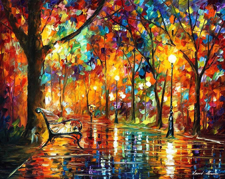
<img src="./leonid-afremov.jpg" alt="Night lights" class="di-bl mb-05 mw-100-p" />
<span class="di-bl py-05 ta-ce">Leonid Afremov</span>
</a>
</div>SIGN UP
Create your free account and choose the plan that fits your needs.
To get this layout, copy this code and paste it into your HTML.
HTML:
<div class="card wi-16 my-2 py-05 bsw-2 bo-cyan-8">
<div class="di-fl fd-co ai-ce">
<img class="card__img wi-60-p" src="http://via.placeholder.com/150" alt="">
<h3 class="card_title mt-2 ta-ce fs-125">SIGN UP</h3>
<p class="card__text fs-1 lh-125 grey-17 fw-3 ls-01 px-1">Create your free account and choose the plan that fits your needs.</p>
</div>
</div>Divider with Text
Divider with text centered
To get this layout, copy this code and paste it into your HTML.
HTML:
<div class="bc-blue-9 ta-ce wi-100-p">
<p class="ta-ce mx-au mw-32a py-4 white">Divider with text centered</p>
</div>Code
For displaying code in a black box on a webpage. I use these settings:
To get this layout, copy this code and paste it into your HTML.
HTML:
<pre><code>Type in some HTML code here........</code></pre>Note: replace < with & lt and > with & gt.
Keyboard - kbd
Press Ctl+l to quit.
To get this layout, copy this code and paste it into your HTML.
HTML:
<p>Press <kbd class="kbd">Ctl+l</kbd> to quit.</p>